Note: To access the Green House Brand Guide, click here.
To begin
Whenever designing digital assets, remember the acronym EPCO:
E - Engaging: Digital assets should captivate the audience with original and helpful information. Engaged audiences are more likely to convert into loyal customers.
P - Professional: Digital assets should reflect a polished, authoritative appearance. Professionalism enhances business credibility and trustworthiness.
C - Consistent: Consistency in design across platforms and content is key. It reinforces professionalism and helps consumers recognize and trust the brand.
O - On-brand: Ensure digital assets are aligned with the company’s brand. Consistency leads to stronger connections with the audience and more impactful messaging.
_______________________________________________________________________________________
1. Sizing
a. Proportional sizing:
- Larger elements should be used for more important content; avoid making everything look big because it will lose its impact.

b. Spacing around elements
- Ensure appropriate padding and margin sizes to keep things from looking cramped. This will affect readability.

c. Relative sizing
- Keep sizing consistent across similar elements (e.g., all subheaders the same size, all icons the same size).

_______________________________________________________________________________________
2. Consistency
a. Use brand colors
- Use a consistent color palette throughout your design to reinforce brand identity.
 b. Use brand fonts
- Stick to two or three fonts and font styles across all elements to create cohesion.

c. Maintain a unified look
- Apply the same spacing rules (e.g., equal padding and margins) to maintain balance throughout the design.
_______________________________________________________________________________________
3. Contrast
a. Readability
- Combine light text with a dark background (or vice versa) for improved readability.

b. Highlight important elements
- Use color contrast to highlight essential elements, like buttons or key calls to action.
c. Size contrast
- Increase font size for key content like headings, while keeping body text smaller.

_______________________________________________________________________________________
4. Balance
a. Symmetrical balance
- Elements are mirrored on either side of an axis, creating a formal and organized feel.

b. Asymmetrical balance
- Unequal elements are arranged thoughtfully so that the design feels balanced, but with more dynamic energy. Often used for more modern designs.

_______________________________________________________________________________________
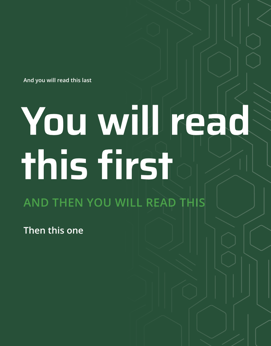
5. Hierarchy
a. Size
- Larger elements attract more attention, so make important elements (like headings or calls to action) bigger.
- Ensure that the size of each element reflects its level of importance. When too many elements are the same size, it creates visual clutter, making it difficult for the eye to focus on what matters most.
b. Color
- Use contrasting colors to draw focus to key areas (e.g., brighter colors for emphasis).
c. Typography differentiation
- Differentiating headings, subheadings, and body text through font weight and style creates a clear flow.
_______________________________________________________________________________________
6. Visual Interest
a. Use patterns or textures
- Add subtle patterns or textures to backgrounds or borders to give the design a tactile quality without overpowering it.

b. Incorporate unexpected elements
- Include dynamic elements like asymmetry, overlays, or pops of color to break up uniformity and draw attention.

c. Utilize imagery
- Use high-quality images or illustrations that are relevant and eye-catching to elevate the design’s appeal.

_______________________________________________________________________________________
7. Additional Helpful Information
a. Gestalt’s Principles
- A set of psychological theories that describe how humans naturally perceive visual elements and organize them into patterns or wholes. These principles are often applied in design to understand how people visually interpret the world around them.
- Elements that are close together are perceived as related. For example, group items in a list close to each other so people understand they belong together.

2. Similarity
- Items that look similar (in shape, color, or size) are perceived as belonging together. Using the same font for headings help create a unified visual group.

b. When you design, ask yourself: “What am I trying to say?”
1. Size- Use size to signal importance—larger for headlines or key visuals, medium for secondary elements, small for supporting details. A well-sized layout directs attention naturally.
- High contrast and bold colors make key elements stand out.
- Use varying font sizes, weights, and styles to establish clear hierarchy while adding visual interest.
c. Designing for print vs. digital
1. Digital:
- Type: Smallest text should be 30pt for social posts.
- Color space: RGB.
- Images: Usually you can tell, screen resolution is 72 ppi.
- Bleed: Not applicable.
- File type to export: PNG. JPG, PDF.
- Type: Body copy should be size 9-11 pt. If you are unsure then run a quick test print.
- Color space: CMYK.
- Images: High resolution, 300 ppi.
- Bleed: Color hangs off the edges of the paper, in which case you should include a .125 in bleed.
- File type to send to type: PDF almost always.
- How to send to print
d. Where to print?
- The two main printing services we use are:
- UVU Printing Services (across the freeway)
- UVU Copy Center (2nd floor of the Fulton Library)
e. Who prints what?
- UVU Printing Services: Large orders (> 50 papers, booklets, assets bigger than 13 x 19)
- UVU Copy Center: Small orders (< 50 papers)
f. Example for email requesting prints
Hello! I am ____ with Green House Sales and Marketing at UVU. We are wanting to place an order for 100 z-fold brochures.
Here are the specs:
Colored, double sided, full bleed, and 80lbs textweight paper. Would you be able to have a proof printed for us by the end of the week? And also a quote?
We are hoping to have them all printed by Feb. 20, 2025.
Thank you!
[Attach your file in the form of a PDF]
